
Making Appreciation Visible During a High-Pressure Season
A peer appreciation postcard initiative for Columbia University Facilities & Operations (CUFO) turned a simple communication tool into a visible ritual of recognition.
During periods of organizational strain, appreciation can become invisible even when teams are working harder than ever. That was part of the challenge behind the Peer Appreciation Postcard Initiative developed by CUFO’s Office of Belonging and Engagement during commencement season. Staff had shared consistent feedback about a lack of visible recognition at a time when teams were managing increased workloads, staffing uncertainty, and high-stakes operational demands.
The initiative was not designed to solve those structural pressures on its own. A postcard cannot replace compensation, formal recognition, staffing support, or long-term culture work.
But it can do something smaller and still meaningful.
It can give one person a way to say:
I noticed what you did.
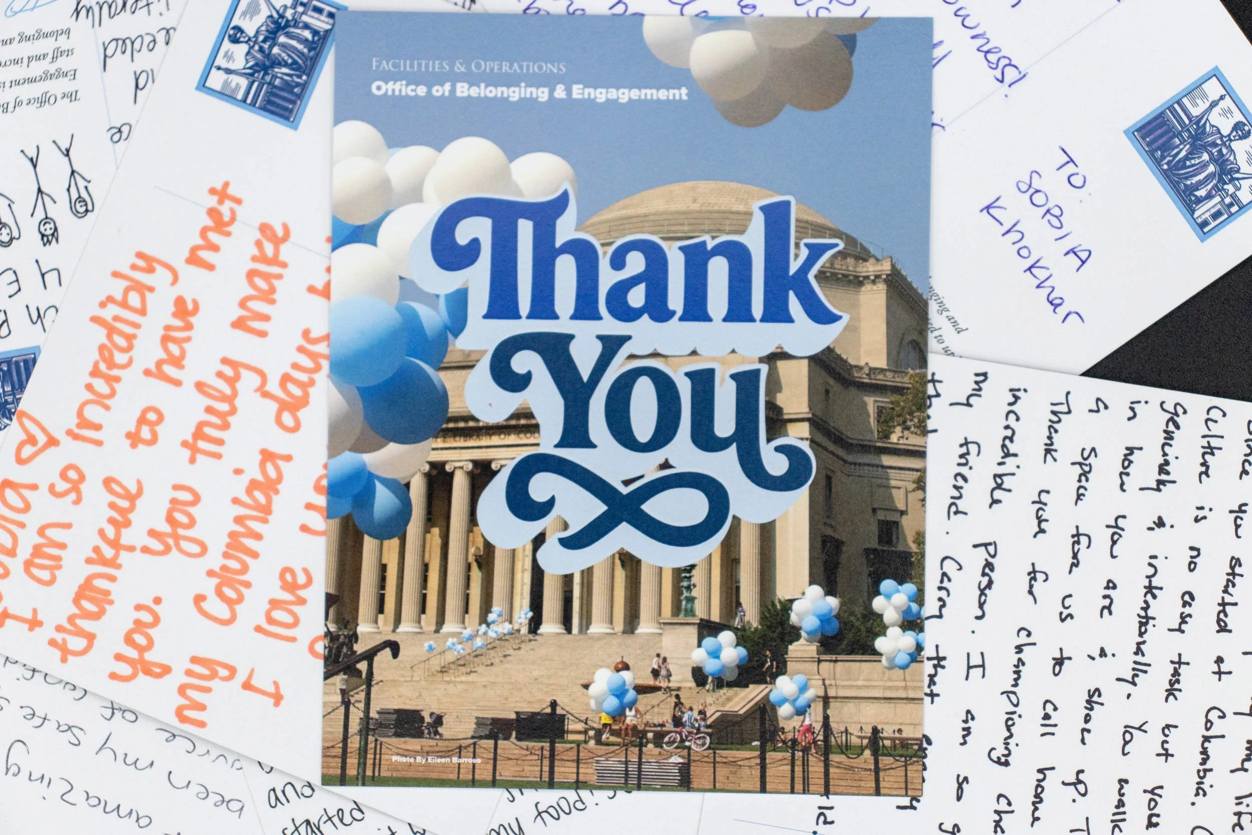
The initiative was designed as peer-to-peer recognition, simple, heartfelt, and direct. Staff could submit a message for a colleague, supervisor, or anyone whose work made a difference, using a Microsoft Form. Each submission was reviewed by the team, then hand-transformed into a postcard and delivered throughout May.
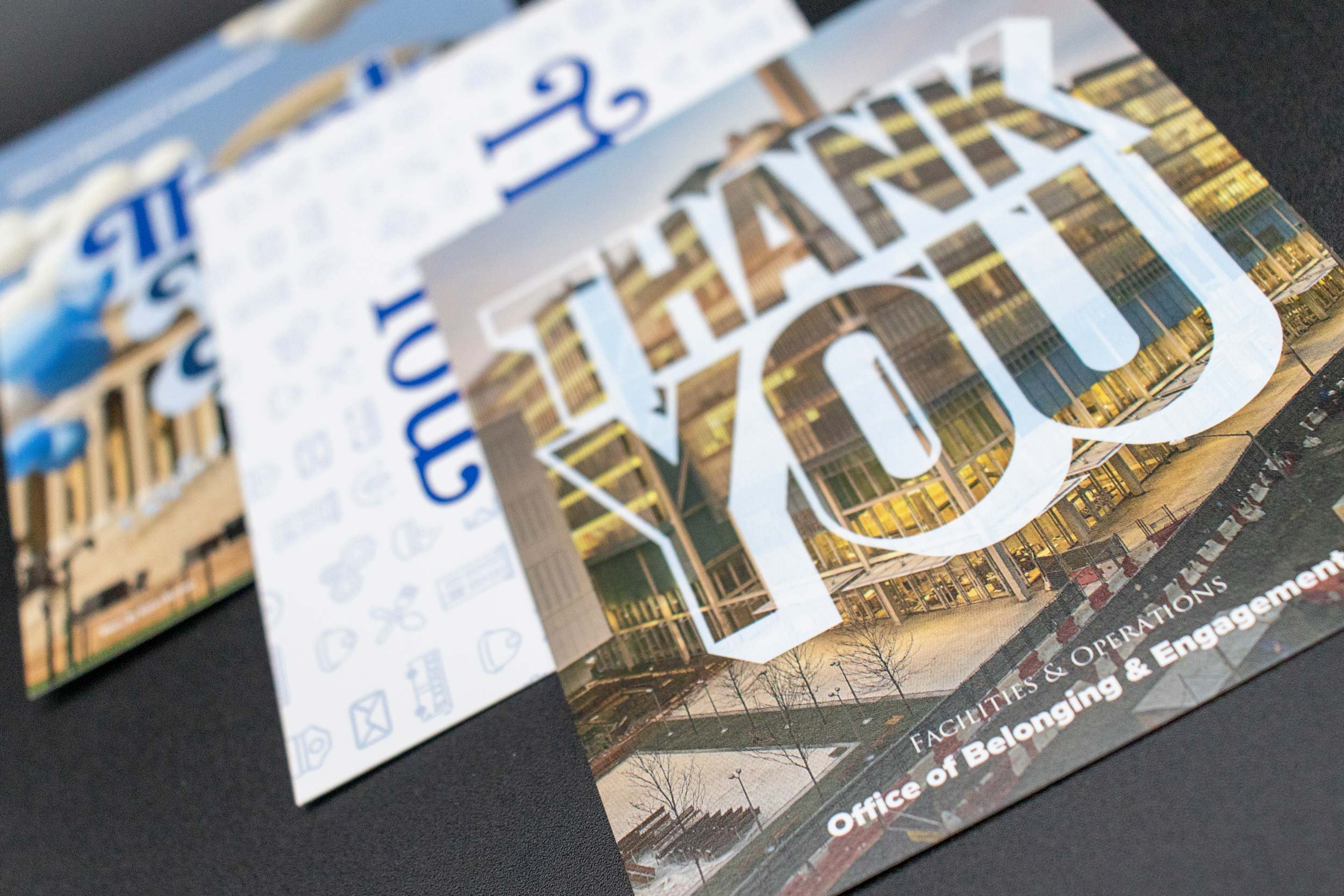
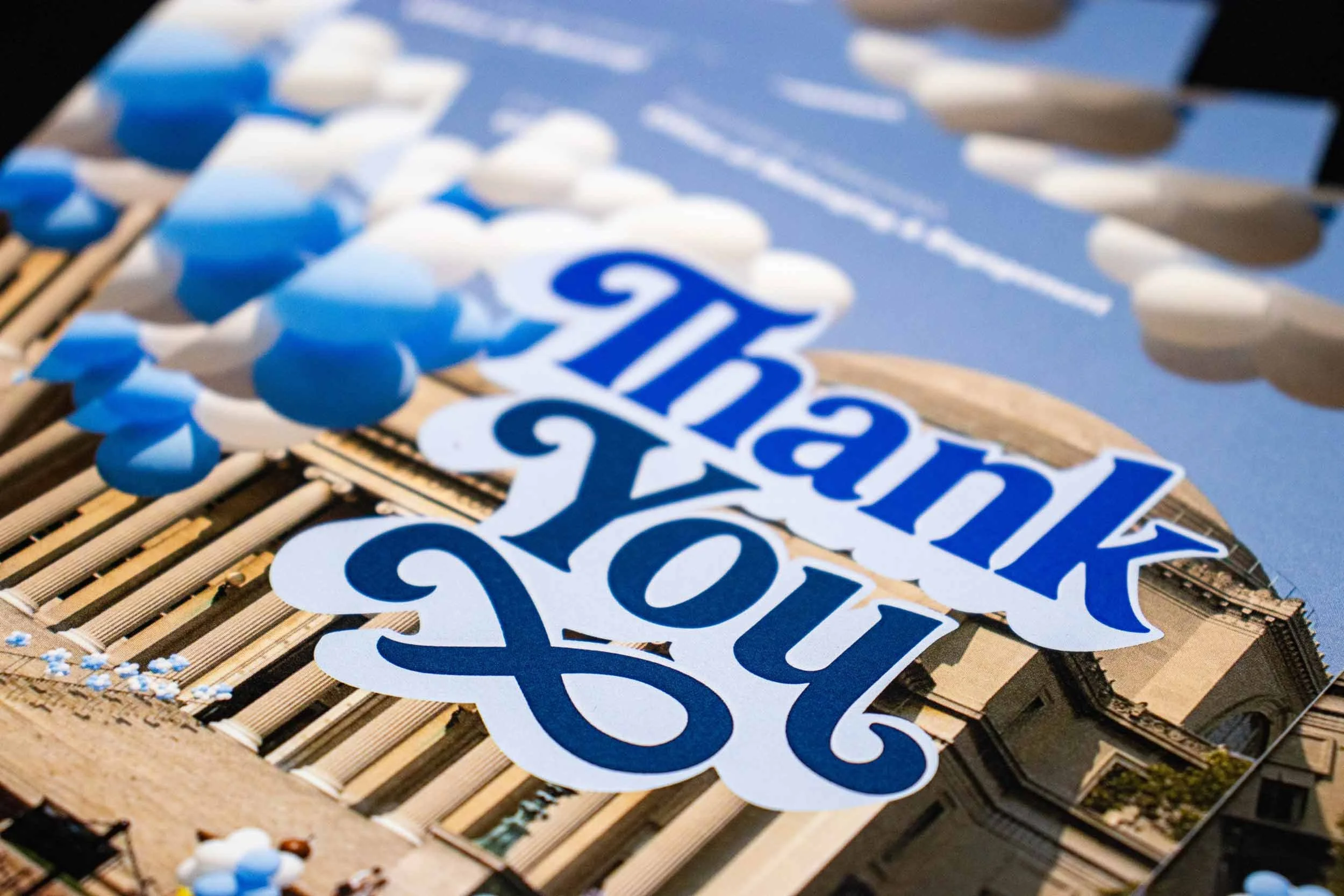
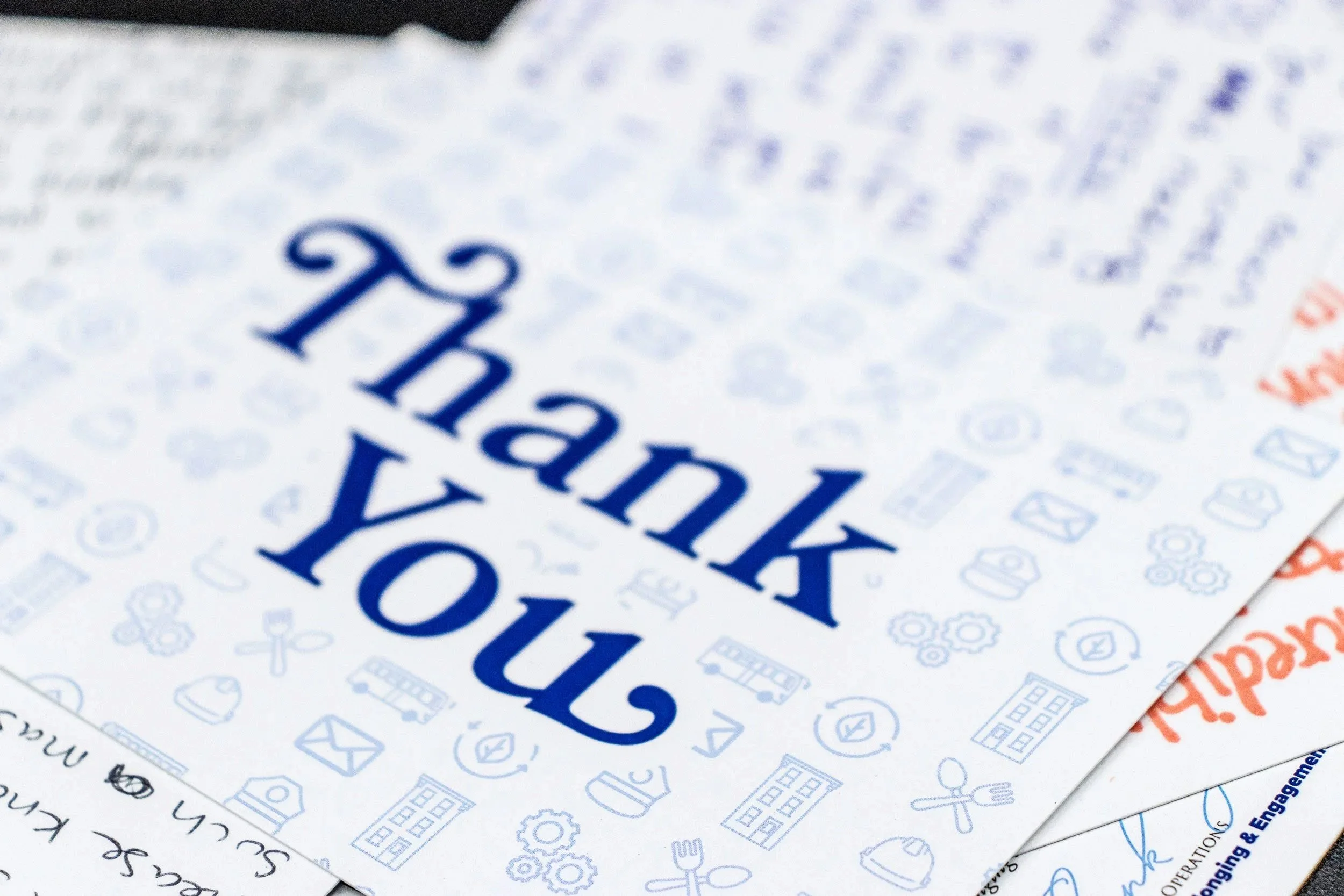
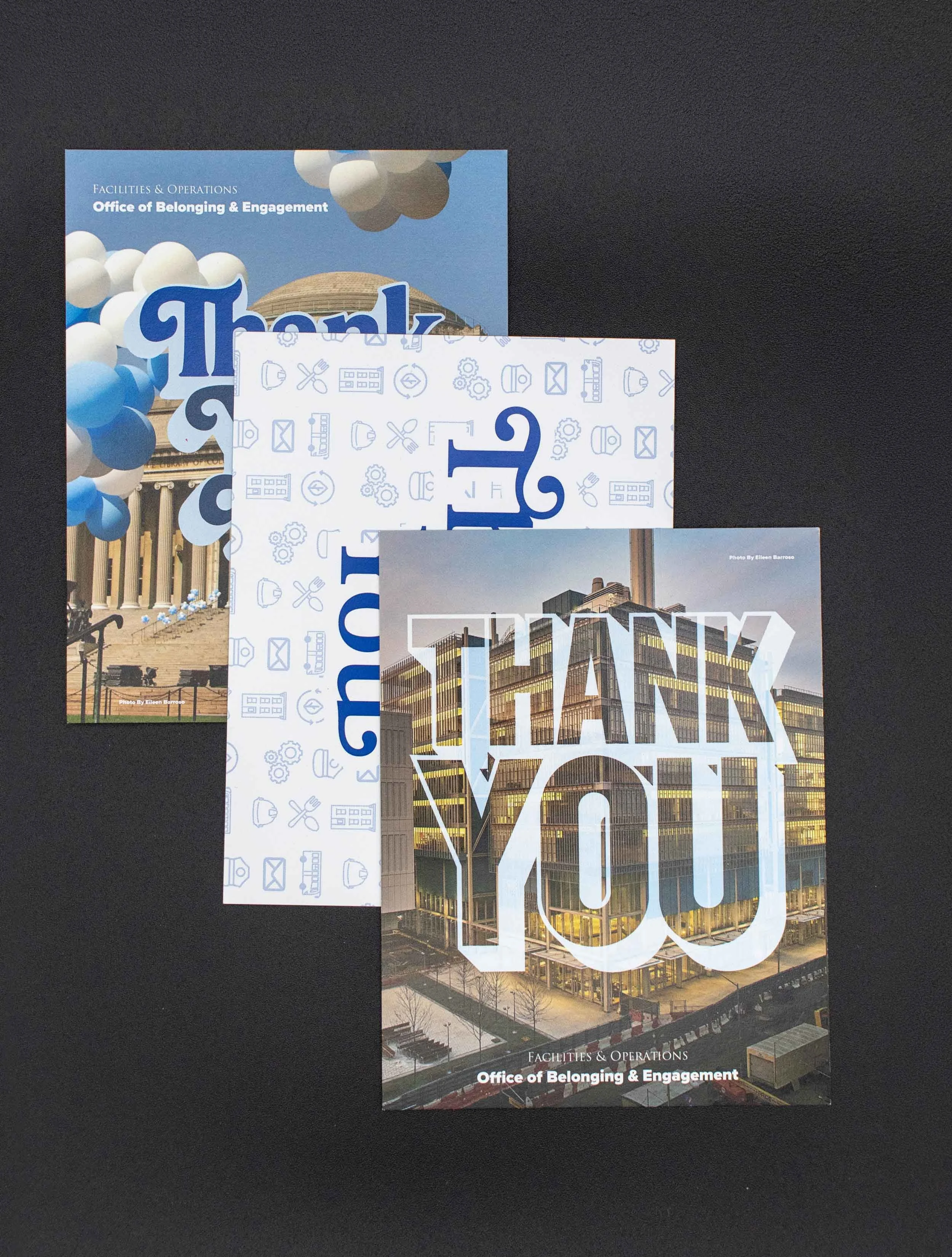
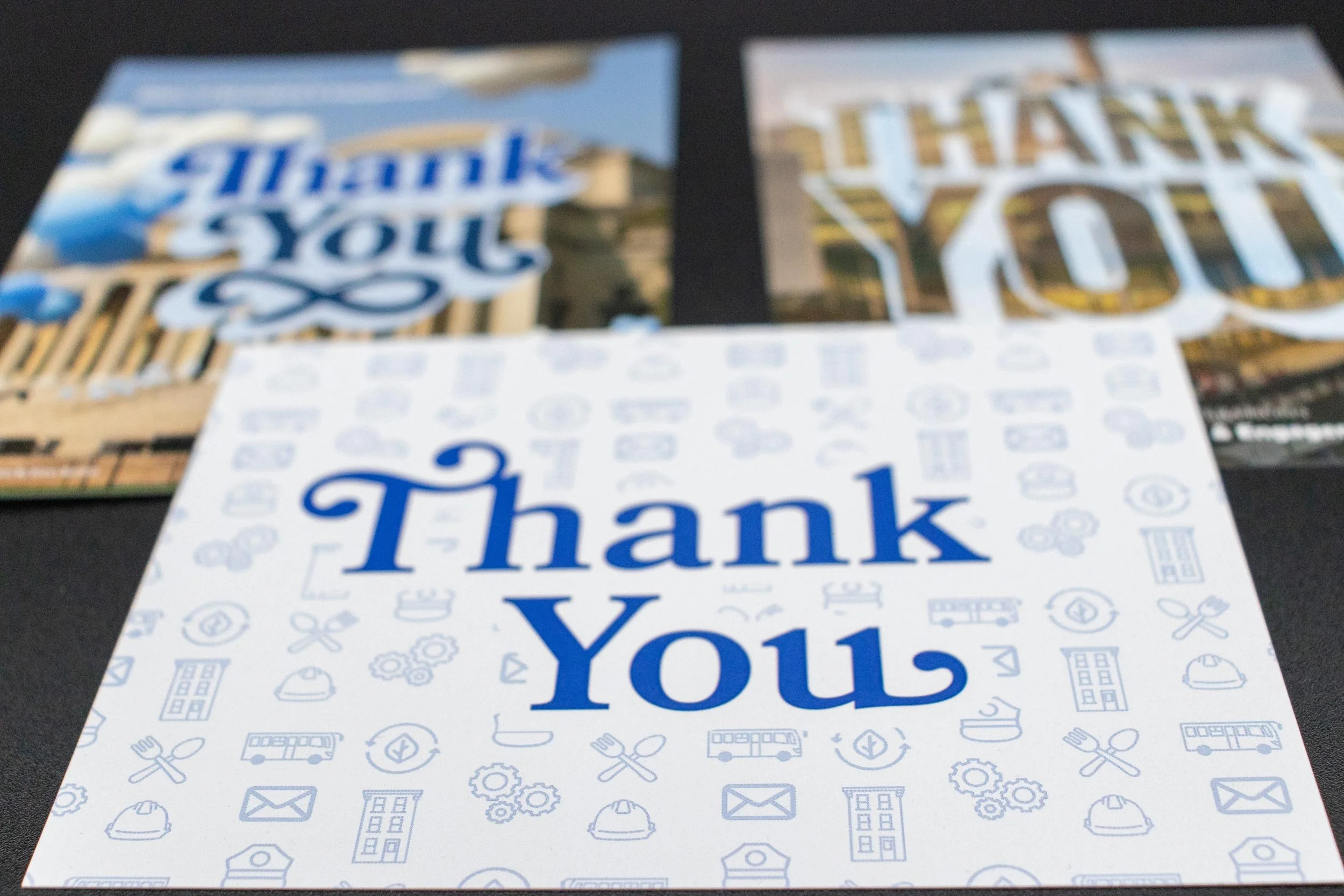
Our team joined the story on the visual side, crafting the postcard’s look and feel. We selected photos from CUFO’s own collection and created a custom, hand-lettered “Thank You” for the front of the card, turning every note into a personal keepsake.

The format was intentionally simple
A handwritten postcard.
That simplicity was its strength. With everyone busy and pulled in a dozen directions, the campaign had to make participation feel effortless, sincere, and truly worth the time. It steered clear of generic HR language or empty “spread positivity” slogans, aiming instead for something real and specific.
The strongest appreciation is specific; it names the action, the impact, the difference made. The campaign encouraged staff to recognize all kinds of contributions: the colleague who showed up for a late shift, the mentor who quietly guided others, the problem-solver who kept things moving when it mattered most. Even the small, steady efforts got their moment in the spotlight.


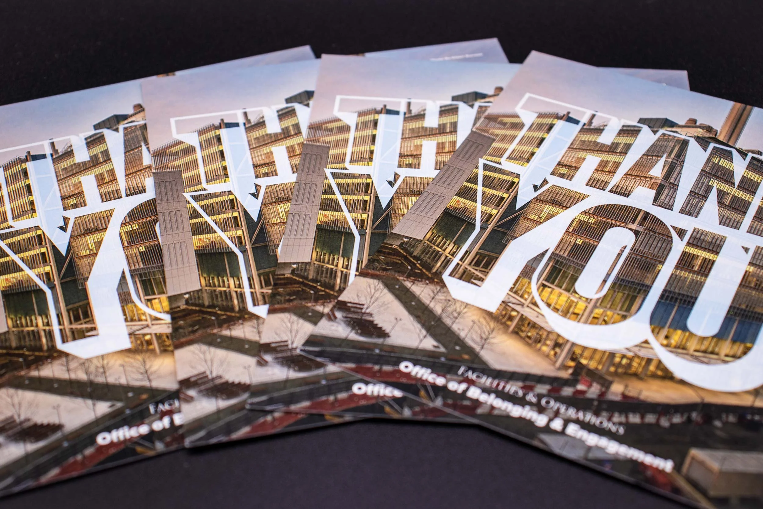
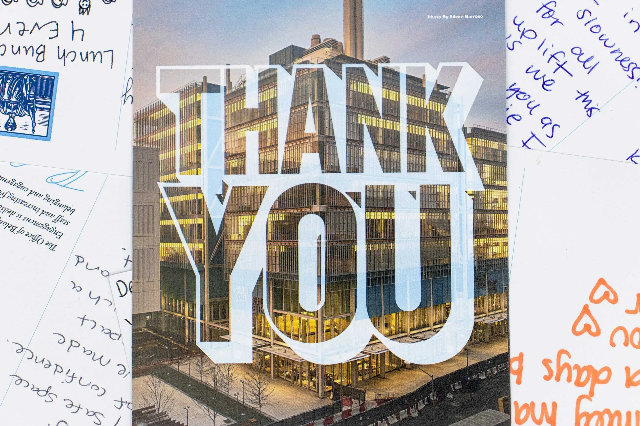
The postcard’s design was built to carry that feeling. We didn’t treat it as just another object; we made it the emotional heart of the initiative. Custom “Thank You” lettering made every card feel personal before the pen even touched paper. The chosen photography wasn’t stock or generic; it drew straight from CUFO’s own spaces and faces, rooting every note in real community.
This mattered because the project carried real tension. Staff needed recognition, but everyone knew that symbolic gestures, no matter how heartfelt, can feel empty if they try to stand in for deeper support. From the start, the brief made it clear: the postcard was an extra, not a substitute for formal recognition or compensation. That honest boundary shaped the whole tone.
The goal was simple:
Warmth without overstatement.
But the challenge wasn’t just about looks; it was about making the whole operation work. In just two weeks, CUFO staff sent in more than 700 submissions. That number doesn’t prove culture change overnight, but it does say something important: when recognition is easy, personal, and clear, people show up for each other.
The initiative’s warm reception and the recognition of its thoughtful design raised the profile of the Office of Belonging and Engagement across CUFO. The humble format revealed its own secret: a postcard is small enough to feel doable, but real enough to hold meaning. It asks for just a few minutes, not a major lift. It offers a structure for gratitude, so no one has to find the perfect words alone.
Behind the scenes, the initiative also had to account for practical delivery realities. CUFO staff work across teams, roles, shifts, and locations. Some work late shifts or weekends. Some recognition messages could be anonymous. Submissions had to be reviewed before delivery to make sure they aligned with CUFO policies. Postcards had to reach people respectfully, without creating unnecessary privacy concerns.
Those backstage details are easy to overlook, but they’re what make internal communication credible. A good campaign isn’t just what people see; it’s the invisible system that lets a message move through an organization with care and respect.
For us, this project was a reminder: small artifacts, when designed for real-world use, can carry powerful strategic weight. The postcard had to feel human, but it also had to move through a real process: form submission, review, handwriting, delivery, receipt.
That simple chain of steps made appreciation something everyone could actually see.
The project also reflects a broader principle in mission-driven design: not every valuable communication tool needs to be large, complex, or highly produced. Sometimes the right format is the one people can actually use.
A handwritten postcard cannot solve structural workplace challenges on its own. But small communication tools can still create moments of visibility, acknowledgment, and connection; especially during periods when people are stretched thin.
In this case, the work gave CUFO staff a simple way to recognize one another during a demanding season. A few minutes. A specific message. A card someone can hold. Sometimes that is the right scale for the work.
Takeaways
-
Appreciation often goes unseen during high-pressure periods, even when teams are working their hardest; focus on making recognition a visible ritual to combat organizational strain.
-
The strongest appreciation is specific. It must name the action taken, the impact, and the difference made. Encourage recognition of all contributions, including the small, steady efforts.
-
Choose a format that is intentionally simple, like a handwritten postcard, to ensure participants feel effortless and sincere, and that the effort is truly worth their time. The format should be “small enough to feel doable, but real enough to hold meaning.”
-
Use design elements like custom hand lettering or photos drawn from your own spaces and faces to make the artifact feel personal and emotionally connected to the real community, turning every note into a personal keepsake.
-
A good campaign relies on a careful and visible process, such as submission, review, respectful delivery, and accounting for different work shifts and locations. This allows the message to move through the organization with care and respect.